KPIs Over Time
Category: Performance Metrics · Widget ID: oee.kpi-chart
What it shows
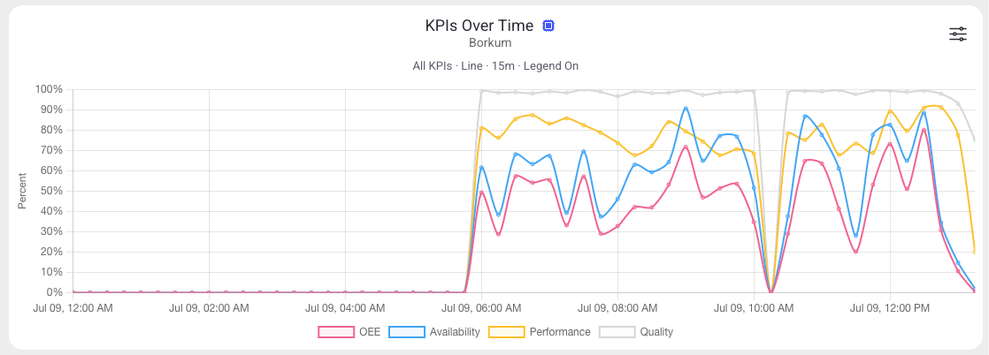
Shows KPI percentages over time (such as OEE, Availability, Performance, Quality) using the Reports API, so you can follow how the KPIs evolve across the window.
Data and refresh
- Data source: Reports API (time series).
- Time range: Respects the selected time period (plotted across the window).
- Machine filter: Respects the selected machine(s).
- Widget locks: You can lock this widget to its own machine and/or time range (Machine lock / Time lock) so it ignores the dashboard filters. See Custom Dashboard.
Configuration
Open the widget's filter menu (slider icon), then select Configure to change:
- Series mode: Single KPI or All KPIs
- Single KPI metric (when Single): OEE, Availability, Performance, or Quality
- Chart type: Line or Bar
- Bucket: time resolution
- Show legend
How to read it
Each series is a KPI plotted as a percentage over time. Use it to correlate KPI dips with events.
Interactions
- Widget filter (top-right icon) — open the widget's own settings to change its display.
Screenshot
Troubleshooting
Widget shows no data -> No events in the selected machine/period, or a filter is too narrow -> Widen the time range or change the machine, then refresh once -> If a machine that normally reports data stays empty, use Troubleshooting > Connectivity.